
 The first American technician to introduce the Western trader to the art of Japanese candlestick’s was Steve Nison. In the early 1990s he was the first trader in America to publish a book on understanding
Japanese candlesticks and their patterns.
Greg Morris as well as myself (“Technical Applications of Japanese Candlesticks”) authored books on the same subject a few years later. Now there are hundreds of websites that claim to define candlesticks and their patterns. Some of them can be extremely accurate, and some are filled with misinformation and inaccuracies.
 However, before any American author/trader published any information on Japanese candlesticks all material stemmed from first Japanese author to have his work translated into English. Although there is common agreement about candlestick types by many experts, it was Seiki Shimizu’s teaching that became the first information available in the United states in 1986. Shimizu was the first trader to teach and explain Japanese candlestick patterns to the Western world.
 According to Seiki Shimizu, “A chart is like a cat’s whiskers” In his book he writes “Standing on the corner we notice many things… in the case of a skip rope, a child will always focus on the moving rope while jumping. However, this habit and instinct is not limited to human beings. A cat preying for a mouse will wait near a likely hiding hole. If a mouse does appear, the cat must decide which way it thinks the mouse will go and springs in that direction once the mouse begins to move. I don’t think the cat understands the mouse’s feelings and thought patterns. It’s the cat’s whiskers that are said to have the telepathic power of being able to interpret a mouse’s movement by smell, light and wind. Therefore, I believe it is this power that moves a cat’s whiskers, whereupon the cat decides whether to wait or chase after the mouse.
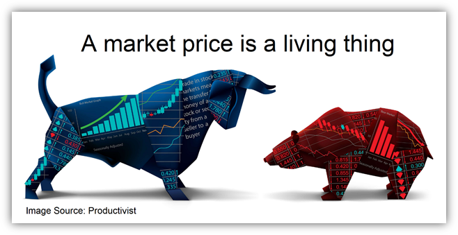
It is said that “A market price is a living thing.” Well without a doubt the movement of stock and commodity prices can be compared to the movement of a mouse.
There are many factors behind such a movement, including political and economical conditions, supply and demand, speculation, and the market mood at the time. It would be impossible, however, to express these factors in the form of percentages… In other words, it’s impossible to understand the mind of the mouse.
 Putting these internal factors aside, when a mouse appears, one should be able to judge instantaneously whether the mouse will move to the left or right by looking very closely at its first movements.
Saying that the market price is the mouse and we are the cat, rather than studying a mouse psychologically, it would appear better to actually observe its movement, noticing what happens when it takes short steps or when it stops moving and opens its mouth. Its these observations that will help the cat to understand and determine movements of the mouse in future encounters.
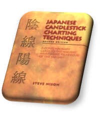
The method and measurement is called the chart. In other words, a chart is just a picture of a mouse’s past movements and is used to determine the mouse’s next move, like a cat’s whiskers.” All of the candlestick names and descriptions originate from his book “The Japanese Chart of Charts”.
His Fifteen unique candle types and patterns are widely accepted as the first material on the subject of candlesticks and their patterns to be translated into English in 1986. Candle travel from East to West.
Shimizu’s book “The Japanese Chart of Charts”, was first book on Japanese candlestick’s and candlestick patterns that was translated from Japanese into English (1986) and defines fifteen unique candlestick types.
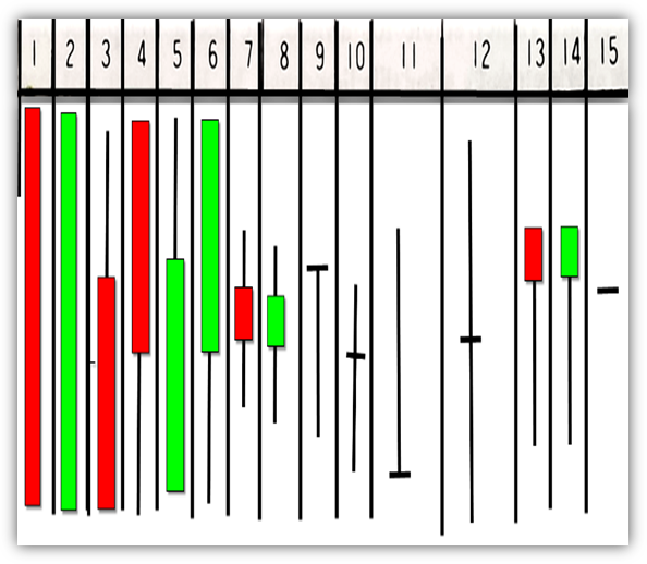
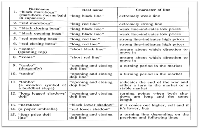
These fifteen candlestick types can be subdivided into large red or green candles, spinning tops, doji, and umbrella lines. A single candlestick alone typically does not convey that much information or insight, however when combined with other candlesticks they form patterns. It is the candlestick patterns that define the difference in analyzing the data. The examples he uses are different in color. He uses black and white because the book is in black and white. The color black represents a lower close, and white candle represent a higher close. In our articles and videos, we will use the traditional colors of green to represent a higher close, and red to represent a lower close.
Pole Lines - Candlestick Types
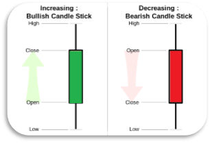 The image below is from Investopedia and is a simple drawing of how a large green or red candle are created including creation of real body, how to sign it a specific color, and a general idea of what a large green or red candle, it also contains a definition of the upper and lower wicks simply as the highest rating price it and the lowest rating price market traded at that session. It is important to understand the significance of each candlestick type because when you analyze a pattern there is much information available in each candlestick of that. There are also a number of candlesticks that can indicate potential. Points are reversals when filed under certain market scenarios. That will be the focus of part three of three of this series.
The real body
Therefore, the process of creating a single candlestick rather than a traditional bar – from a 0LHC is a simple process. The biggest difference is the rectangle is filled in a different color-based market closes above the open or below. Typically, the real body is filled in green to indicate that, and red for the bearish.
When a stock or commodity closes above or below the open the rectangle created exactly the same. In both cases that rectangle is s called real body.
The Wicks
When an upper wick occurs that means that that stock or commodity traded above the closing price for a bearish red candle, or a close below the low of the open that session. Also, these wicks are simply expressed as a linear line drawn from the top of the real body and one beginning at the bottom of a real body whichever occurs, or if both occur.
Whether a market closes higher or lower than its opening. A single large candlestick is significant in that it shows complete control powerful enough to control price domination by the bullish faction will green or the bearish faction when the real body is filled in red. There are many variation to large candlesticks, with the common denominator being that the real body is significantly larger than the bodies that occur in the chart.
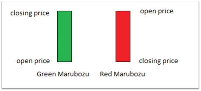
There are two exceptions when a large candle is given a specific a name; The first variations, a Marubozu which occurs when a candle opens on the low and closes on the high, or opens at the high and closes at the low. It is one of the strongest indications of candle strength, trend and indicates the a faction (bullish or bearish) that has absolute domination therefore the greatest impact on price. It is also considered the strongest variation of a long Japanese.
The Marubozu
Both green and red large candles can have wicks above below the real body. However, when they do not contain a wick at either end, they’re given a special label; a Marubozu – meaning bald, or shaven head in Japanese. The illustration below is examples of both bullish and bearish Marubozu candles.
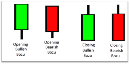
The opening and closing Bozu candlestick
A large green candle that opens at the low, and closes around the midpoint is called a green closing bozu. A large red candle that opens at the high, and closes around the midpoint is called a red closing bozu.
The opposite is true for green candles. A large green candle that opens at the low, and closes around the midpoint is called a green opening bozu. A large green candle that opens at the high, and closes around the midpoint is called a red closing bozu.
Spinning Tops
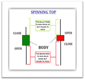 According to Investopedia, “A spinning top is a candlestick pattern with a short real body that's vertically centered between long upper and lower shadows (wicks). The candlestick pattern represents indecision about the future direction of the asset.” This type of candle occurs when neither the bulls nor bears were able to gain the upper hand and although both factions were able to move the price n their favor during the battle neither was an outright winner as the session closed very near its opening price.
Sometimes spinning tops can signal a significant trend change. A spinning top that occurs at the top of an uptrend could be a sign that bulls are losing their control and the trend may reverse. Similarly, a spinning top at the bottom of a downtrend could signal that bears are losing control and bulls may take the reins.
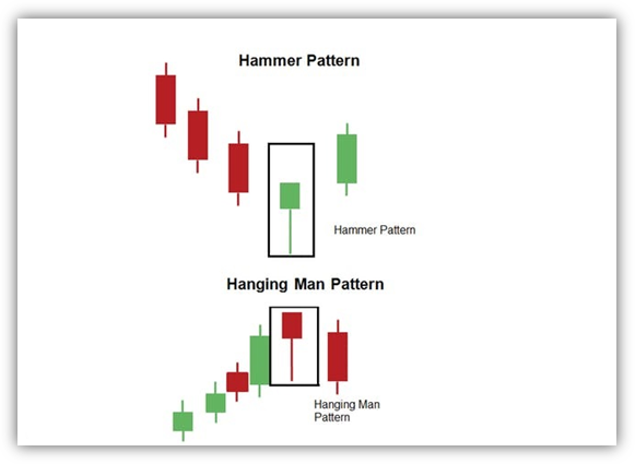
Umbrella lines: The umbrella type candlestick is composed of two variations that are interpreted completely opposite when they are found in a downtrend as opposed to an uptrend. Each variation is the identical candlestick of its counterpart, the differential is simply whether it occurs after the fight uptrend or downtrend.
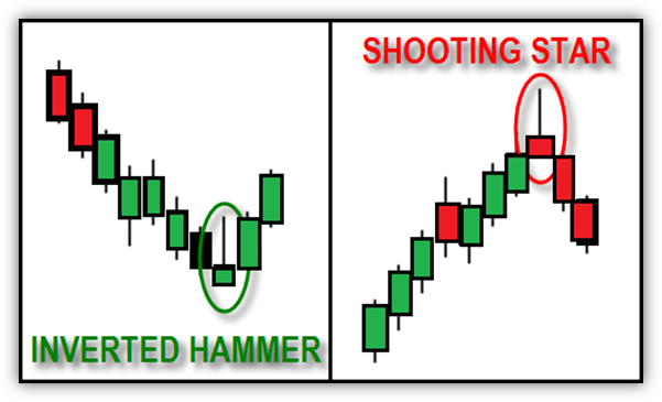
The first of these two types have no lower shadow or wick with a long upper wick roughly three times as large as the real body. This is known as an inverted hammer, if the candlestick is found after defined downtrend. Inversely if it occurs at immediately after an uptrend it is known as a shooting star.
The second variation is labeled a hangman and is found after a defined uptrend, or a hammer when it occurs after a defined correction.
Noteworthy is that this and spinning tops are the only candle types were candle color as the least importance and interpretation. It is where the candle type occurs in the trend and most importantly if it is followed by a confirming candlestick. It is critical that the single candlestick be followed by confirming candlestick before considering it as a valid buy or sell trigger.
For the bullish reversal umbrella lines; the hammer and inverted hammer a confirming candle on a daily chart is simply a long green candle (meaning it closed above the opening price) with a higher high, and a higher low than the previous candle (hammer or inverted hammer).
For the bearish reversal umbrella lines; a hangman and shooting star, a confirming candle on a daily chart is a long red candle with a lower low and a lower high than the previous candle.
These candles can also be part of larger patterns composed of multiple candlesticks in consecutive order. For example, if a long red candle is followed by a hammer or inverted hammer which is below the close of the red candle and then is followed by the confirming candle which is a long green candle, it can be interpreted as a variation of a three River MorningStar.
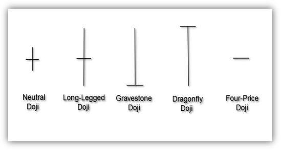
The Doji: A doji is the only Japanese candlestick that looks the very same whether it is drawn as a bar chart or candle chart. While there are multiple variations on how this candlestick will look, Seiki Shimizu defined five distinct variations of this candlestick.
This candle type can mean that the market has moved from a period of trend to consolidation, or more importantly signal a key reversal or pivot points in which either the bullish faction will regain control from the bearish faction, or the opposite. Most importantly this is a key in critical candle which is found in a star formation, and along with spinning tops form one of effective candlestick patterns to identify and along with spinning tops form one of effective candlestick patterns to identify
Conclusion - 結論 - Ketsuron
The greatest accomplishment of Japanese candlesticks in the patterns is that they are able to identify and mathematically quantify market sentiment. The fact that they were able to mathematically express human emotions as it pertains to trading is an exceedingly historical discovery.
Those that are able to understanding and interpret candlestick patterns have a formidable and distinct bandage to those traders unaware of this technique. The Japanese market technician was the first analyst to accomplish the seemingly impossible task.
The mere fact that this technique can identify certain pattern formations that forecast a high probability that a bearish key reversal, or a bullish key reversal. It can indicate the market entered period of consolidation, or a period in continuation is an incredibly powerful technique.
While this technique uses the same data or interpretation and forecasting methods is found in a bar chart, its ability to distill market sentiment from the mathematical interpretation of the market data makes it a superior charting system when compared to its Western culture component, the bar chart.
Read more by Gary Wagner


